Revenue Compare - 2 Year
This is a Club Prophet Executive Report v4 – Power BI or PBI.
Note: Samples are using demo data and do not reflect real-world data.

Revenue Compare – 2 Year
This report shows two overlaying graphs that compares the Selected Year to the Prior Year. The top graph is in Revenue (pre-tax) and the bottom graph is in Quantity of Units sold.
-
The selected year is shown in blue.
-
The prior year is shown in yellow.
-
Where the two years overlap – yellow and blue make green!
This allows you to quickly visualize where the current vs prior year excel.
Let’s zoom in on an example:

You can quickly see in the circled areas above that when you see yellow on top, the Prior year outpaced the Current year. When you see blue on top then the current year outpaced thepPrior year. The rest of the green area is where the two years overlapped. Actual values for the data points, MM/YYYY in this case, are displayed on the graph. You can also hover the mouse over any data point to display a pop-up window with those comparative values.
The same concept applies to the lower graph that shows Quantity of Units Sold instead of Revenue.
Across the top of the screen is a section showing the Total Revenue and Total Quantity for the selected Filters:
Drilling in on Data
There are a variety of Filters on the right side of the graphs:
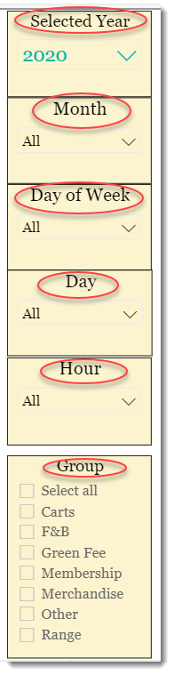
Selected Year
You can select any year in the drop-down list and the graphs will report on that selected year as well is the year prior to the selected year.
Now, if you only want specific months of the year, you can use the Months filter. Hold down the Ctrl key as you click to select multiple months.
Only want to compare weekend? Use the Day Filter to select Friday and Saturday.
Only want to see Green Fees and Carts? Use the Group filter and check off the groups of data you want to see.
Navigation
Both graphs have the ability to drill down from MM/YYYY to specific Date MM/DD/YYYY. To do this, hover over or click on the desired graph and click the Double-Down arrow to drill down:

Use the Single-Up arrow to return back to the MM/YYYY view.
So, let’s use the Filters to drill in on the Covid-19 crises period:

Here we can see that in March (032020) the shutdown had a dramatic negative effect on revenue but there was a significant positive recovery in May over the prior year.
FILTERS
There are various filters you can use to narrow down the data. Filters are the gold background controls as well as the Filters right hand sidebar. So, in addition to the Date Range and Groups you can also filter to a particular Store, General Ledger Account, Category, etc.

Tips
- Filters which are the gold back color controls on the report allow you to pick from a list. Hold down the Ctrl key on the keyboard to select multiple items.
- If you want to search for a particular value, use the filters in the right pane menu. They will have a search box in addition to a list of the items.
- Use the Advanced option in the right menu panel for advanced search options.
- Use the three dots […] in the top right of a visual for more options like Export data.

- Use the Help button to open the user guide for any given report
 .
.